• Creating a user journey
• Paper prototypes from selected features
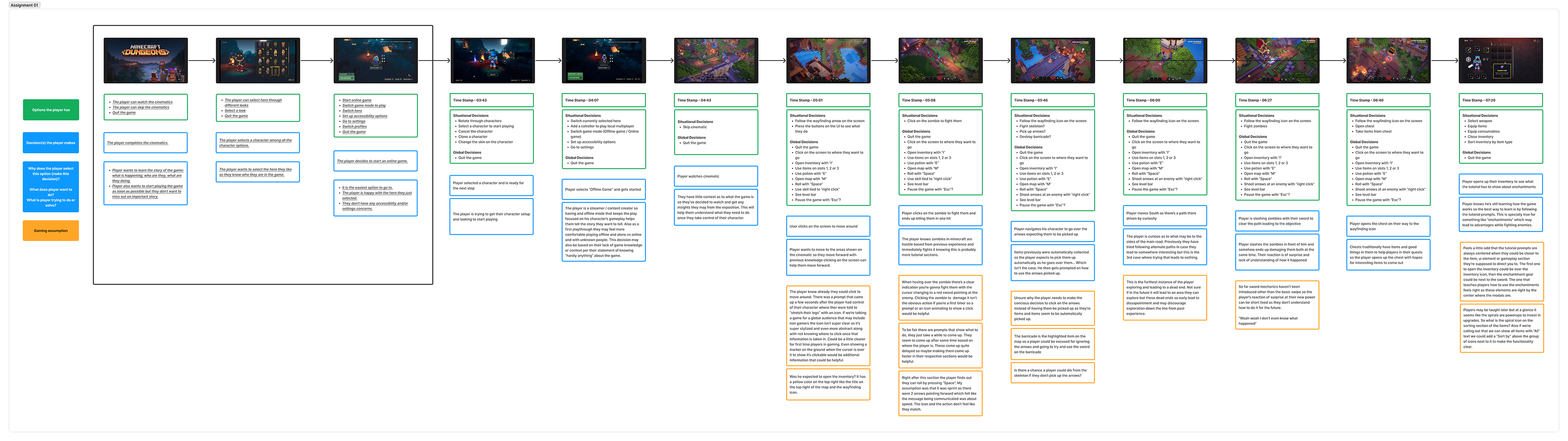
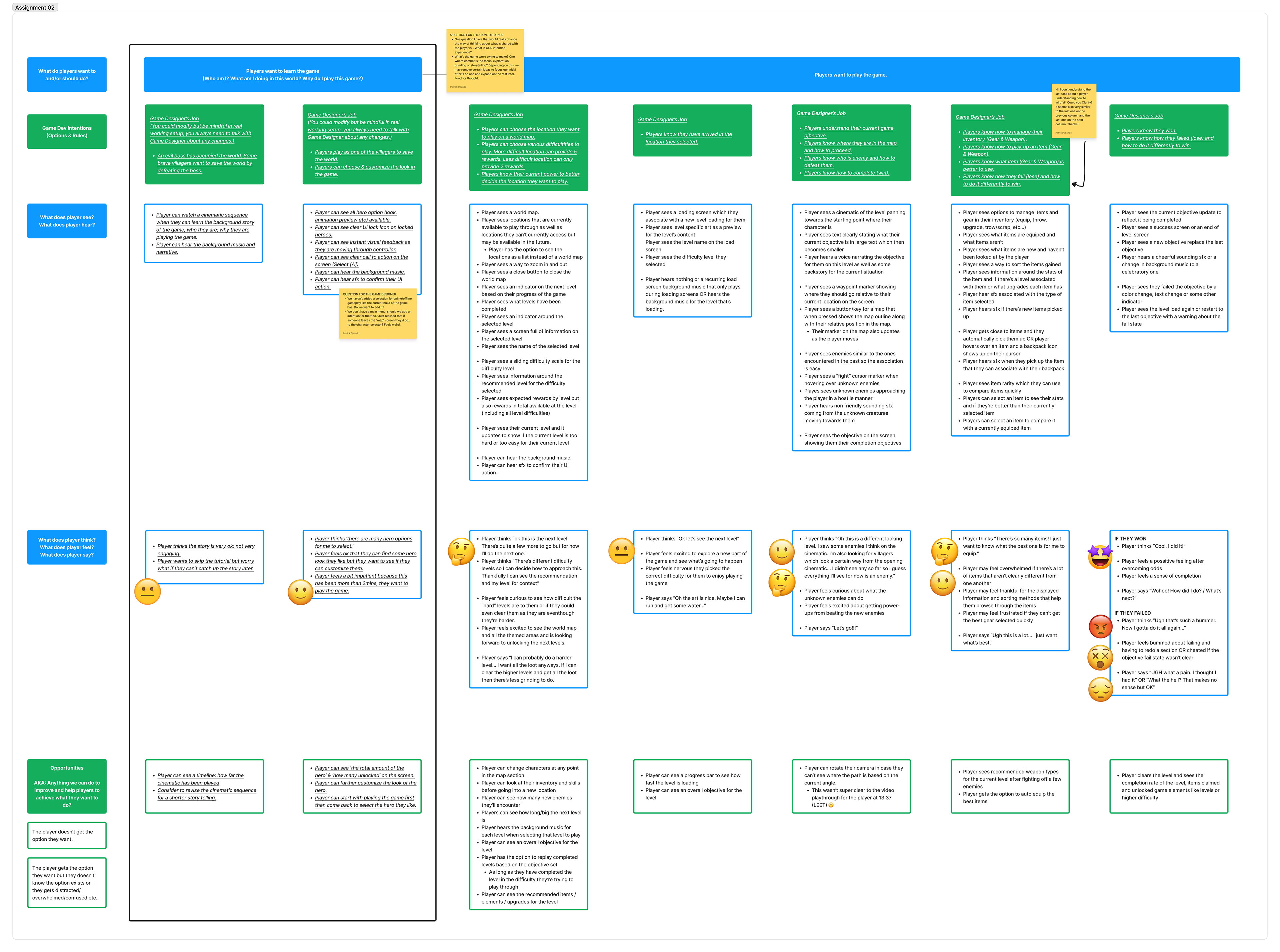
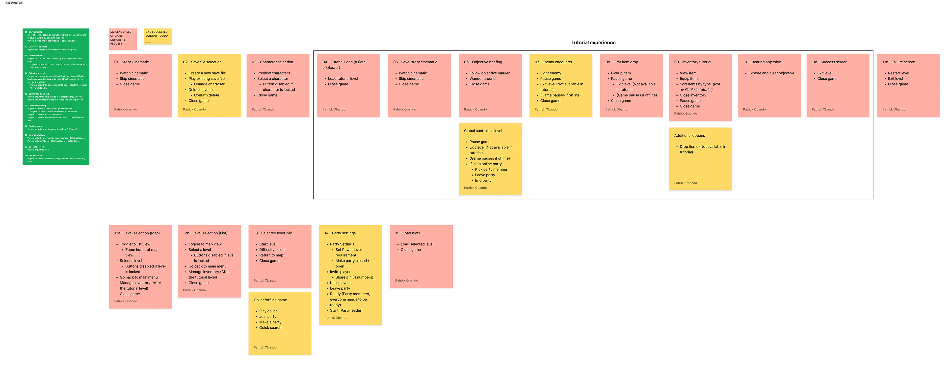
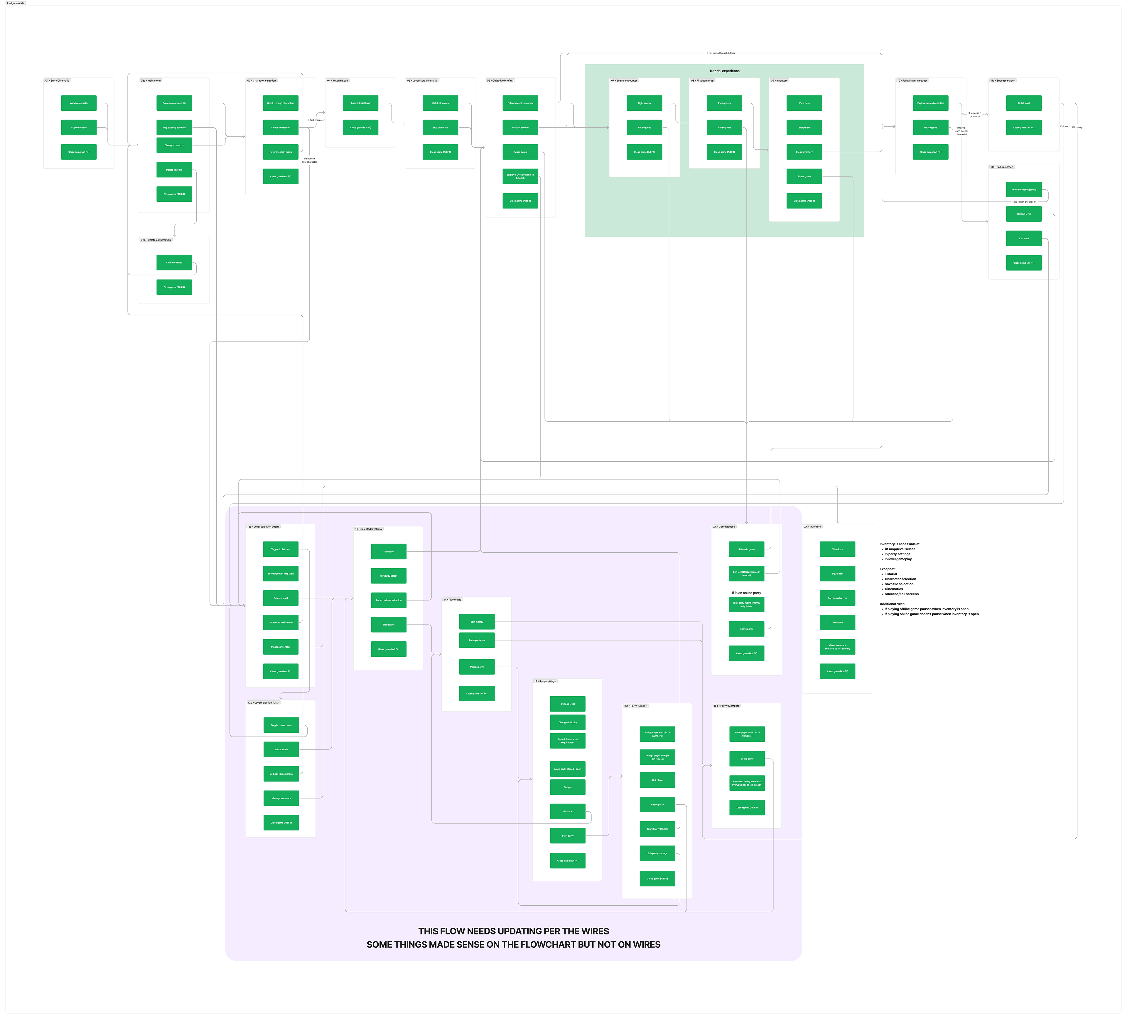
• Flowcharting screens
• Wireframing
• UI mood boards
• UI mockup
• Prototyping
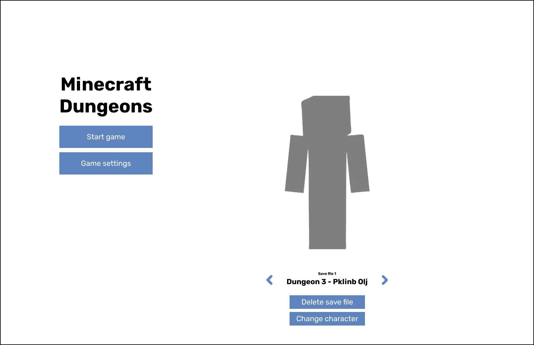
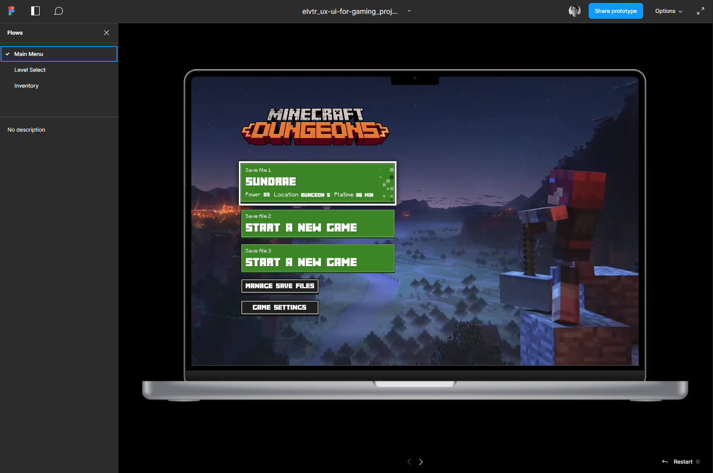
Main Menu
I tried combining save files and the selection on the right side to keep the left side focused on the "Start game".
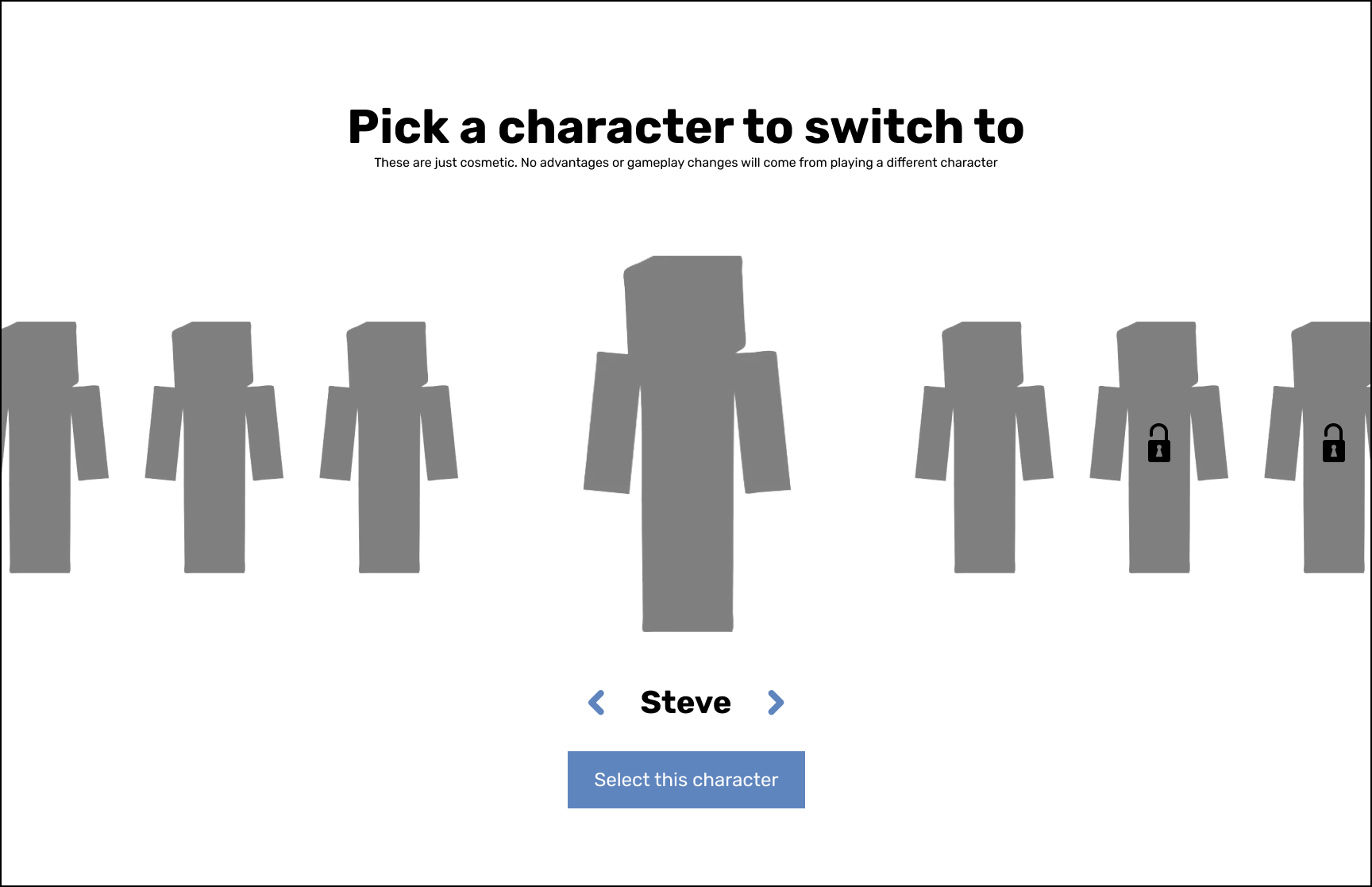
Character Selection
A simple carousel where you select the character you want by moving from side to side.
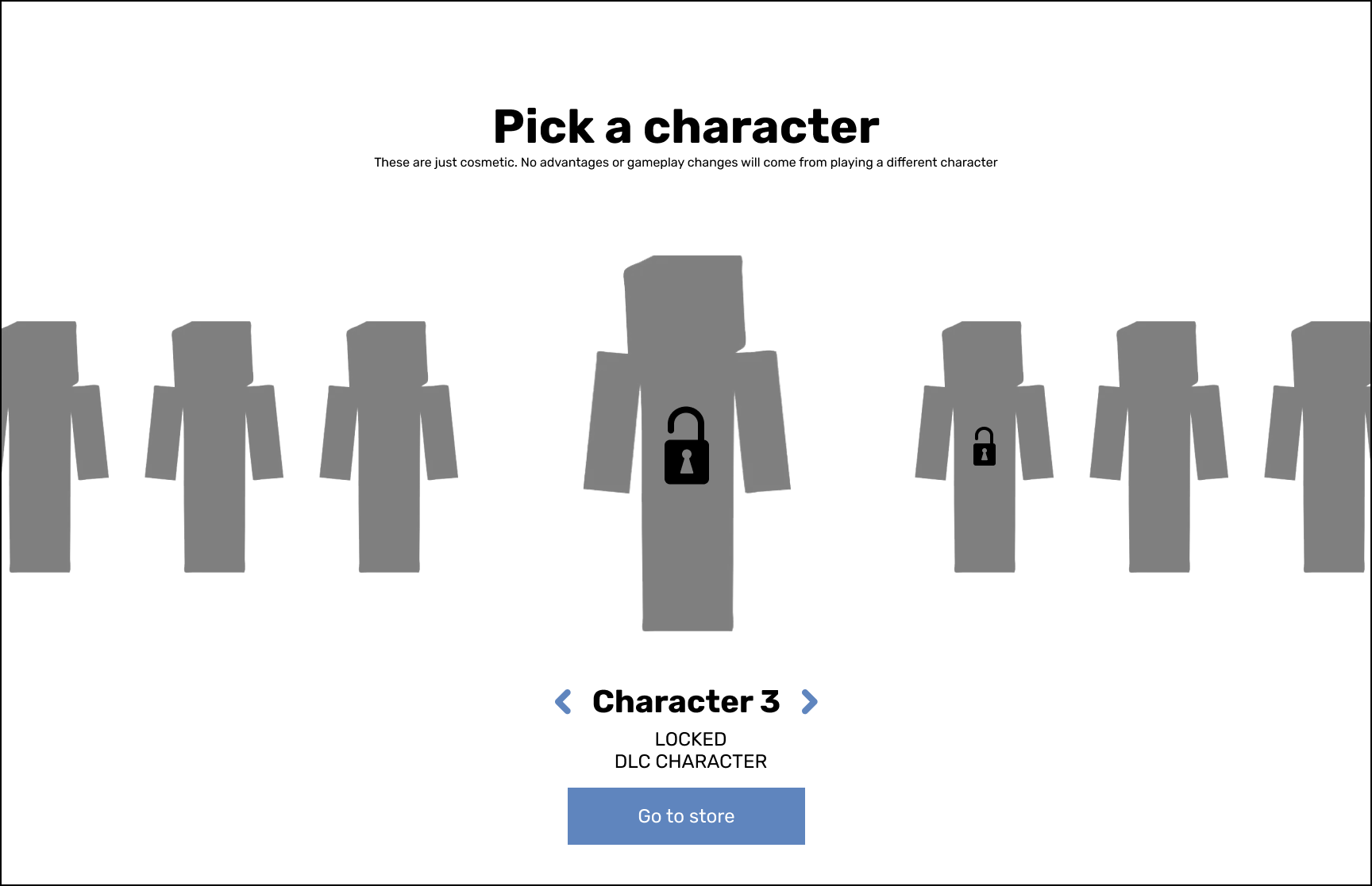
Character Selection (Locked)
Additional view to show locked characters.
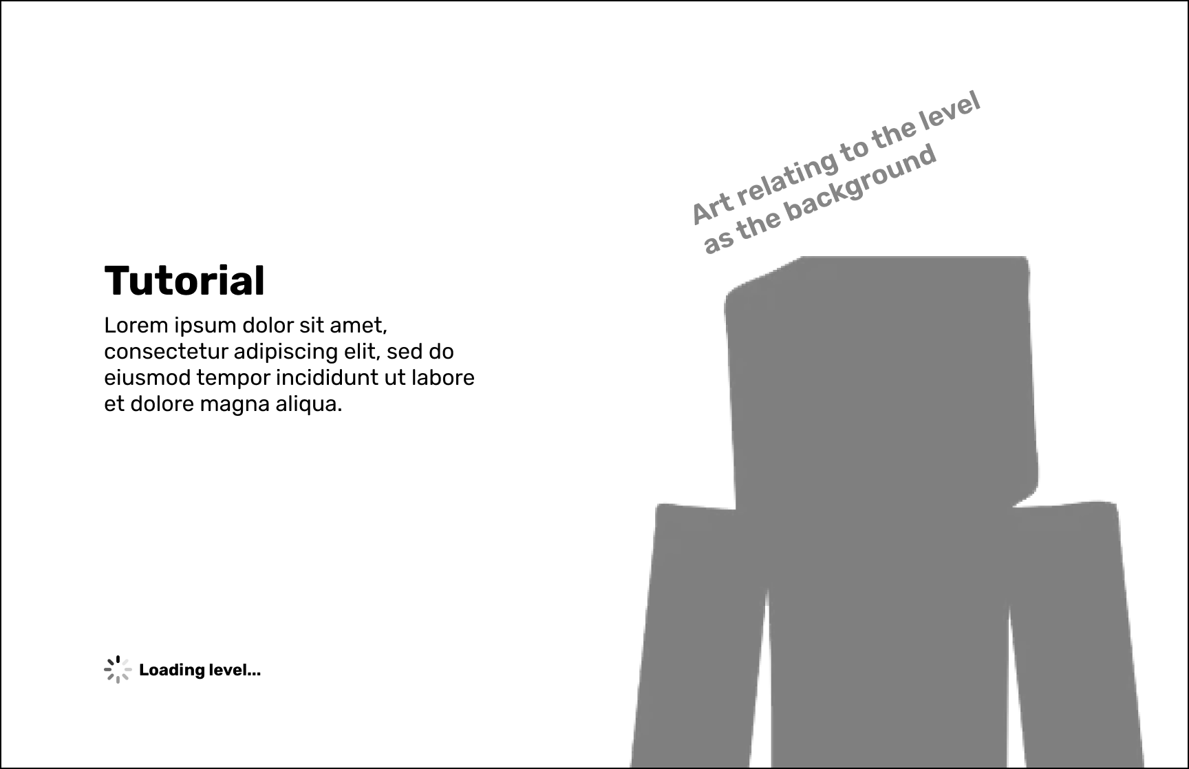
Loading Screen
While players wait for the level to load they get some lore or art in the background.
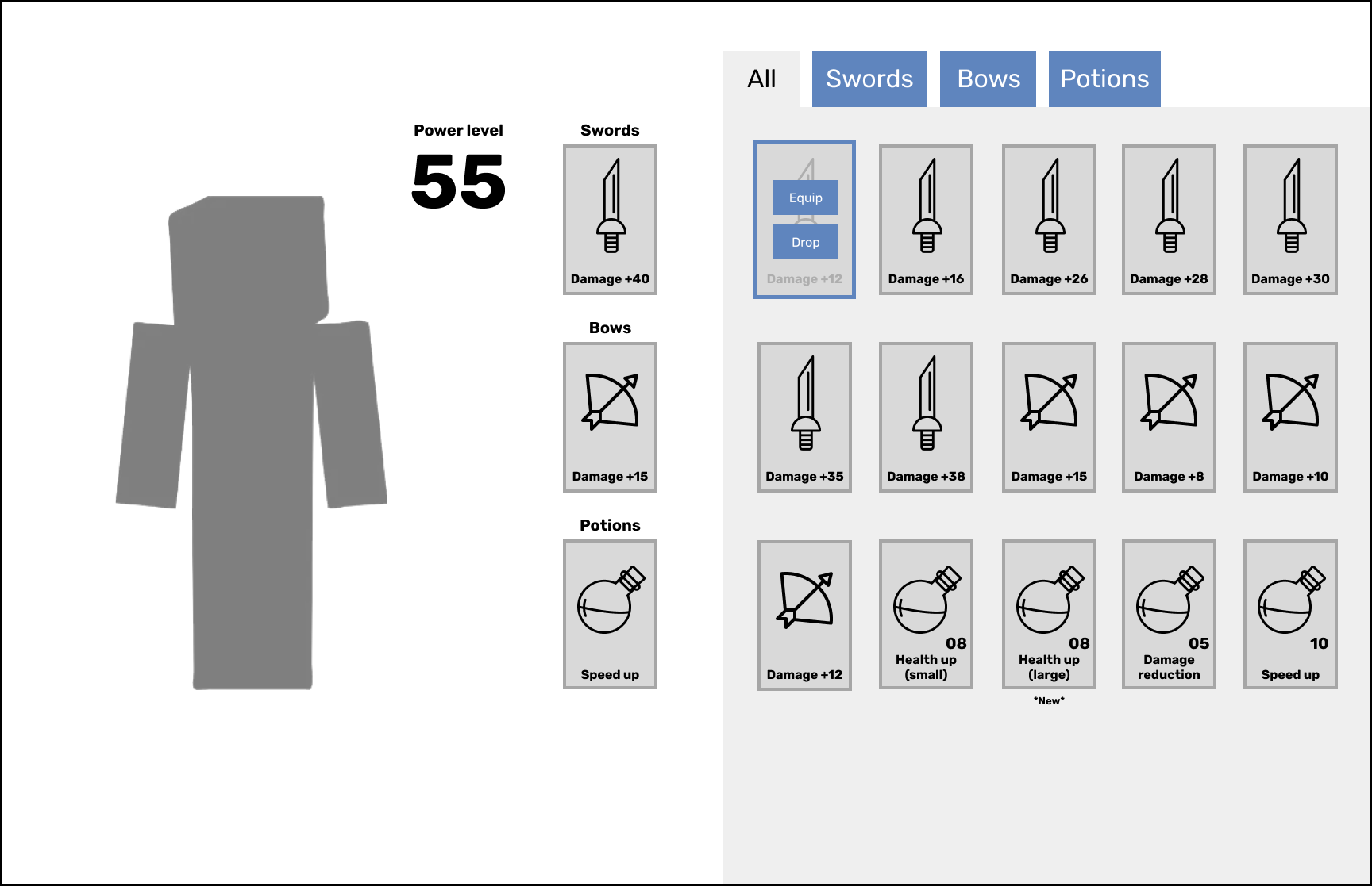
Inventory (Main)
Equipped items would be shown on the left with the full inventory on the right. Selecting an item would show additional controls to equip or drop which would allow for items to be shared in multiplayer modes.
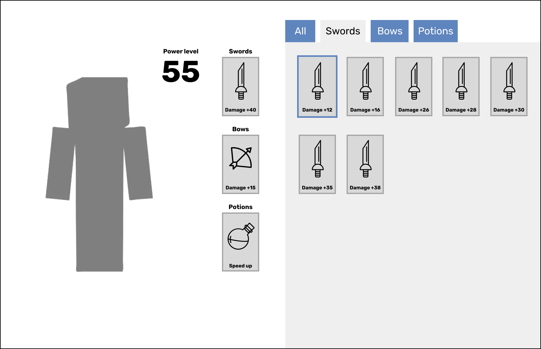
Inventory (Swords)
Tabs at the top would allow for users to sort through item types for a more focused view.
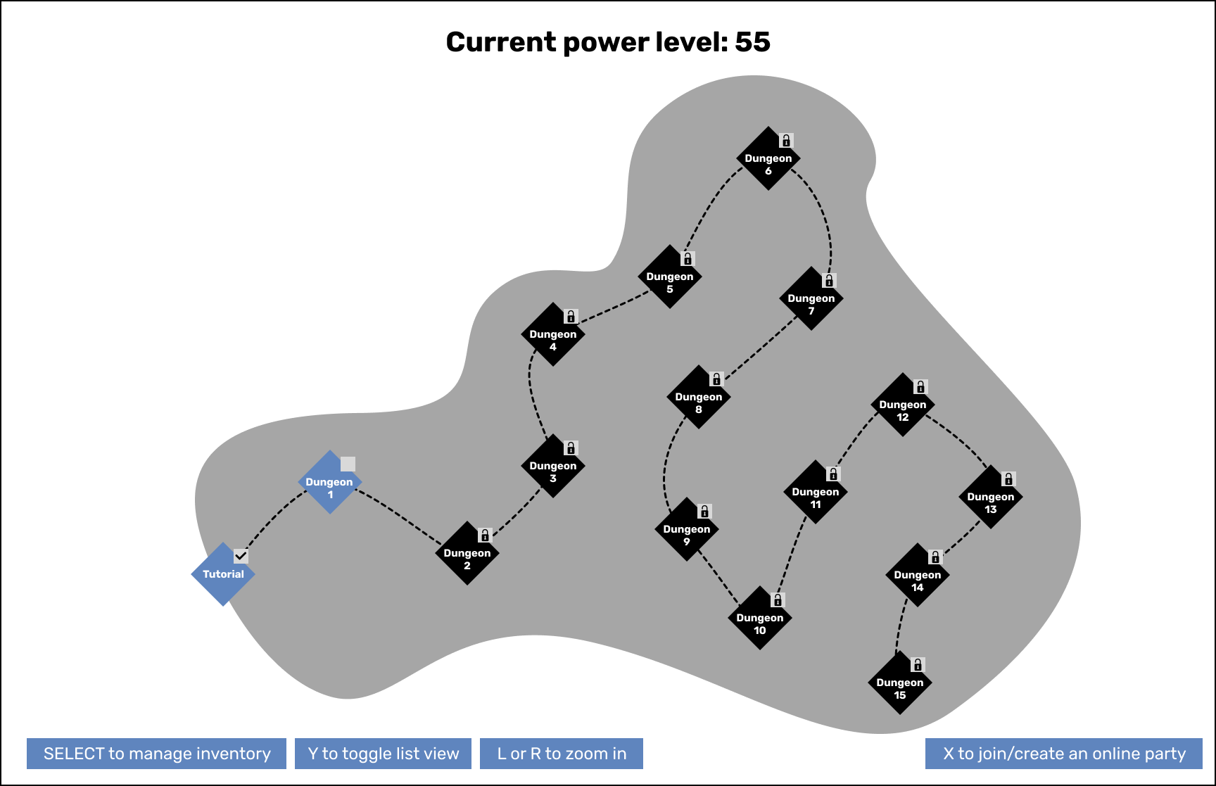
Map View
The main view when a player needs to select a level. They'd be able to view all the different levels to see what's open, locked or see any relevant art that we may add in the end.
List View
For users who may find the map overwhelming we provide a list view that's more streamlined but has the same content. Additionally when starting a new party players can select from multiple options.
Level Select (Party leader)
Players will be able to select higher difficulties per level for additional items but these are not required to complete the game. If you're a party leader or playing alone you would have control over these settings.
Level Select (Party member)
As a party member you let the leader decide and "Ready" to show you're ok with the selection and waiting for the game to start.
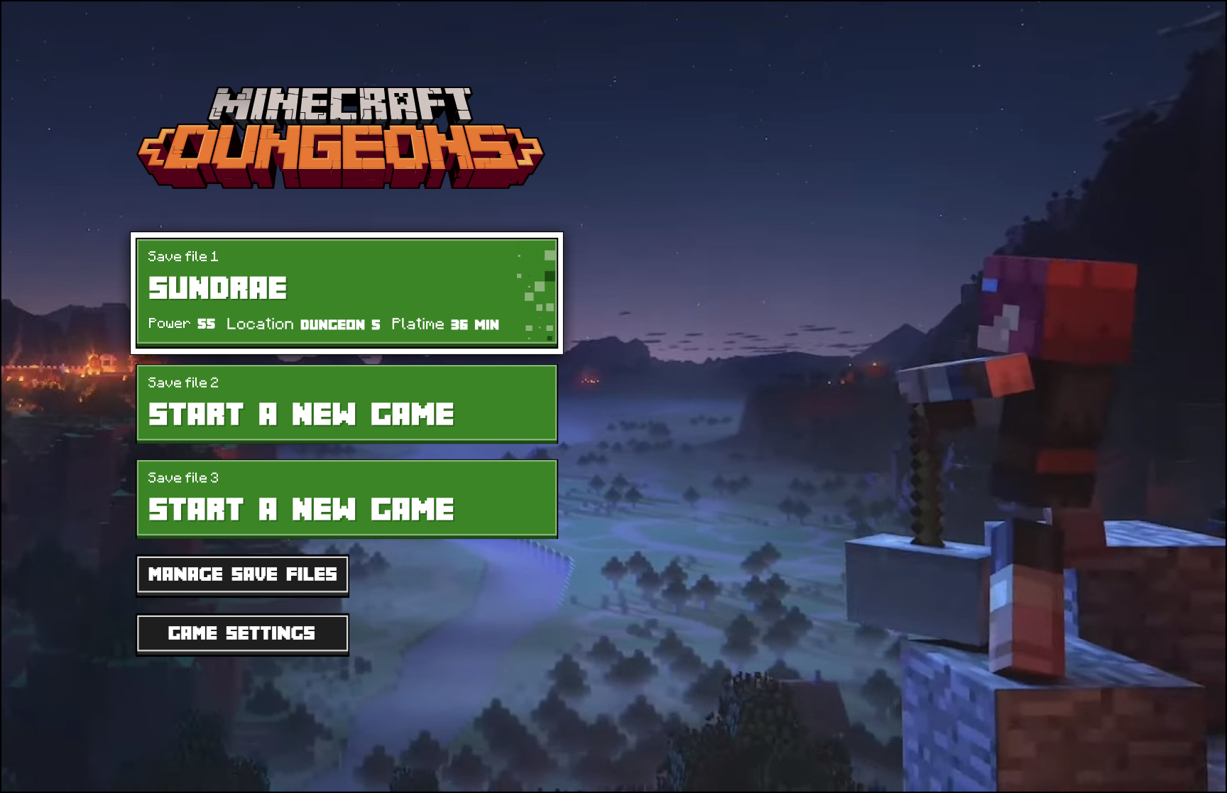
Main Menu
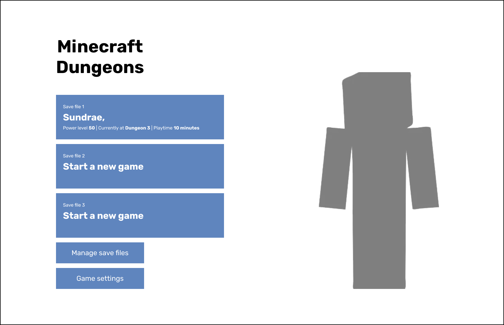
Left the right side empty and moved all functionality to the left. Save files are stacked and managing save files became the option to delete, copy or manage your file otherwise. Now selecting a game file would get you started.
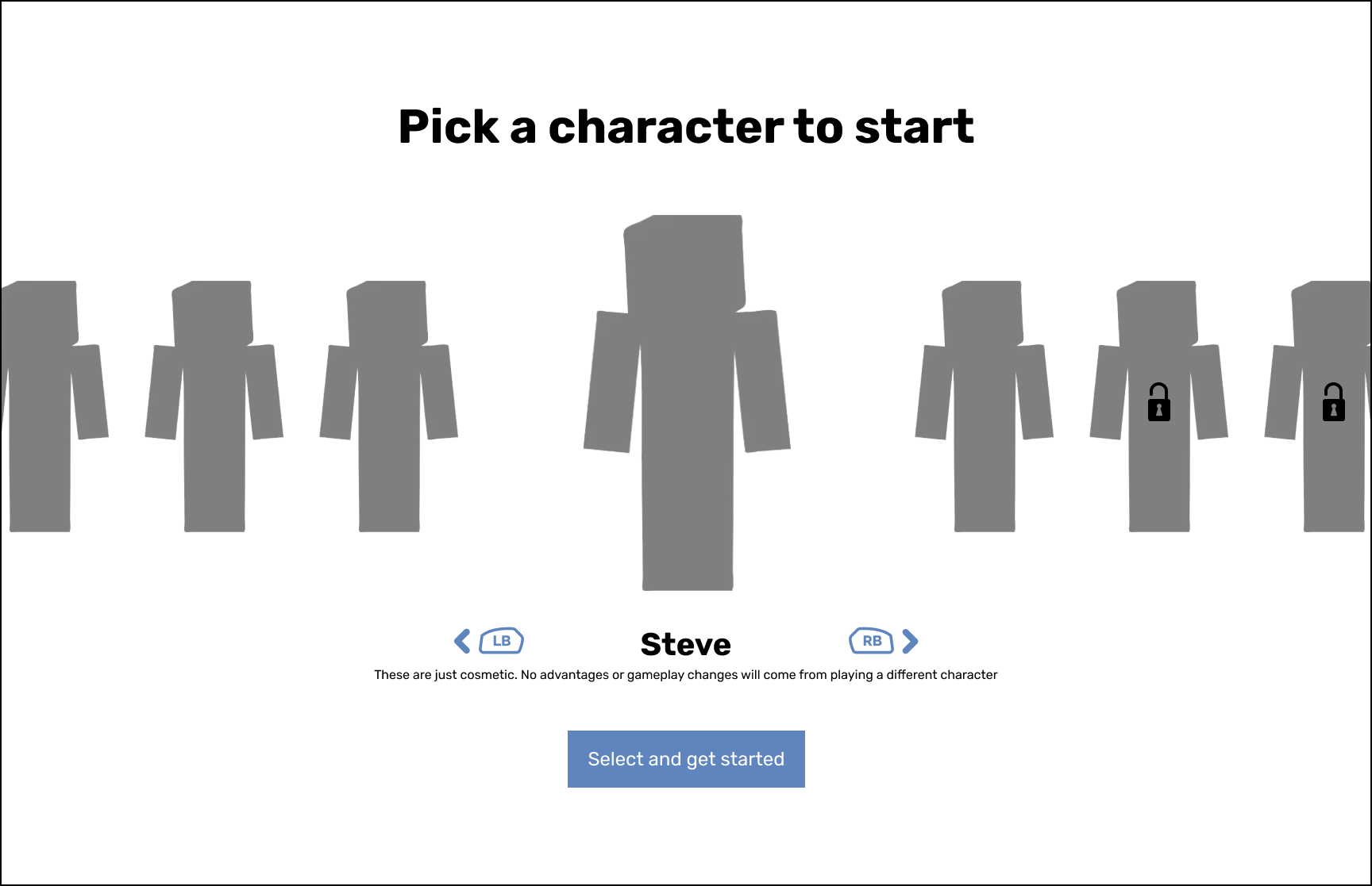
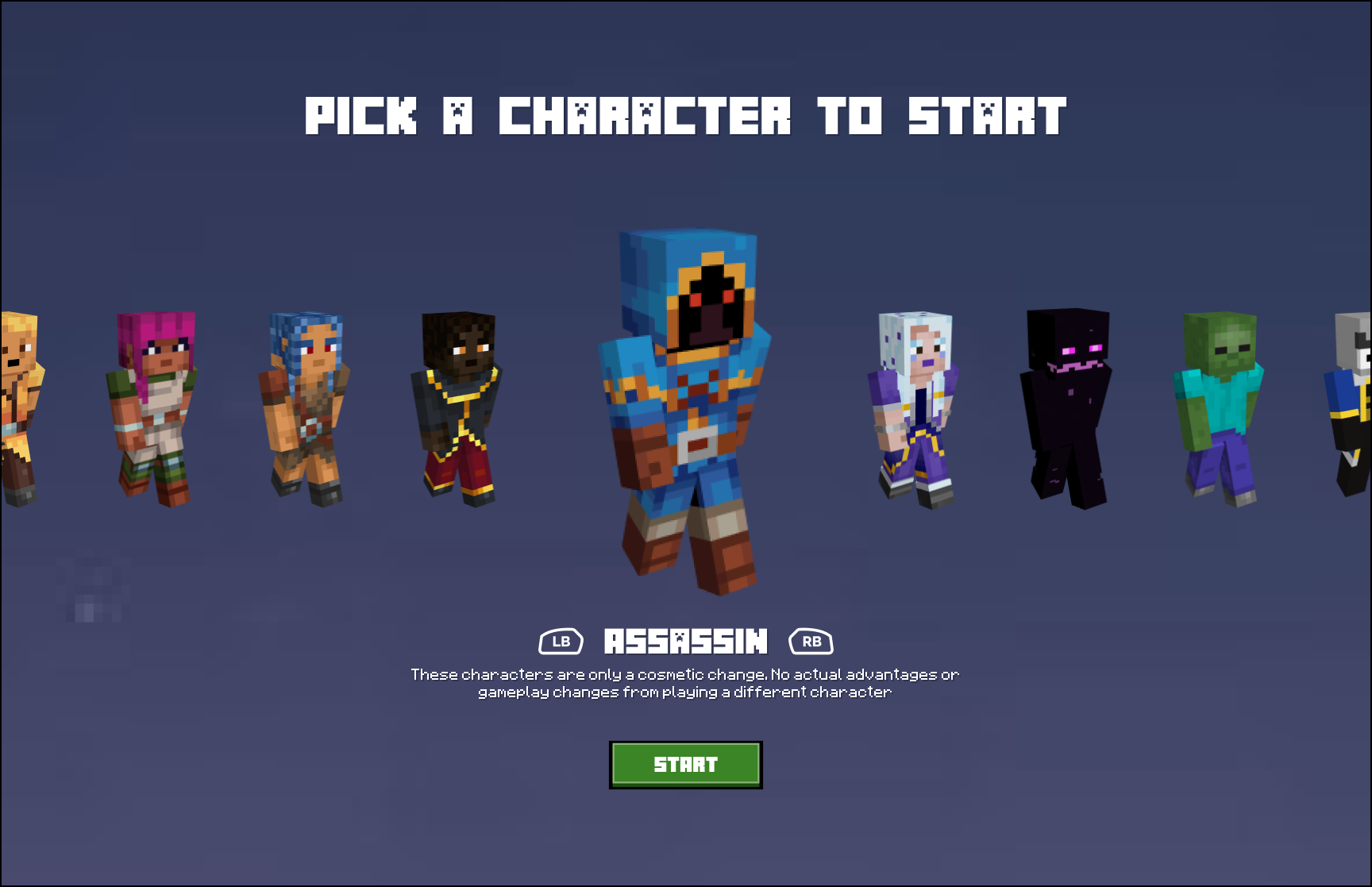
Character Selection
This screen stayed mostly the same other than moving the disclaimer of skins not providing in-game buffs under the character selected so it's closer to where your eyes will be. Additionally added some button icons for clarity assuming an XBOX controller.
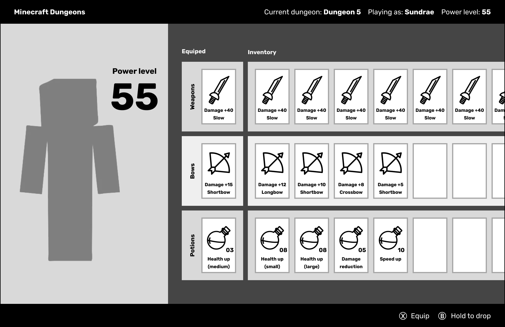
Inventory
A classmate mentioned the inventory seems to be going horizontally which I thought was interesting and decided to pursue it. Since stats management isn't the focus of the game, the best item will be closer to the left where it can be quickly selected.
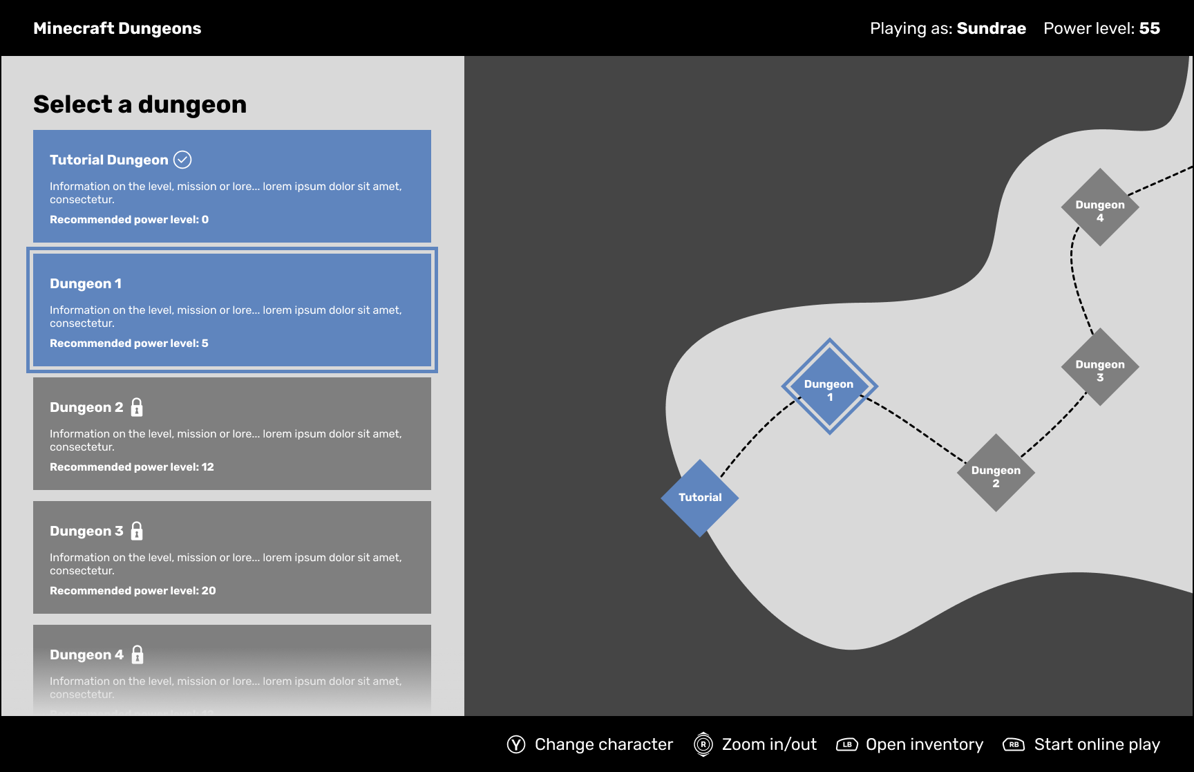
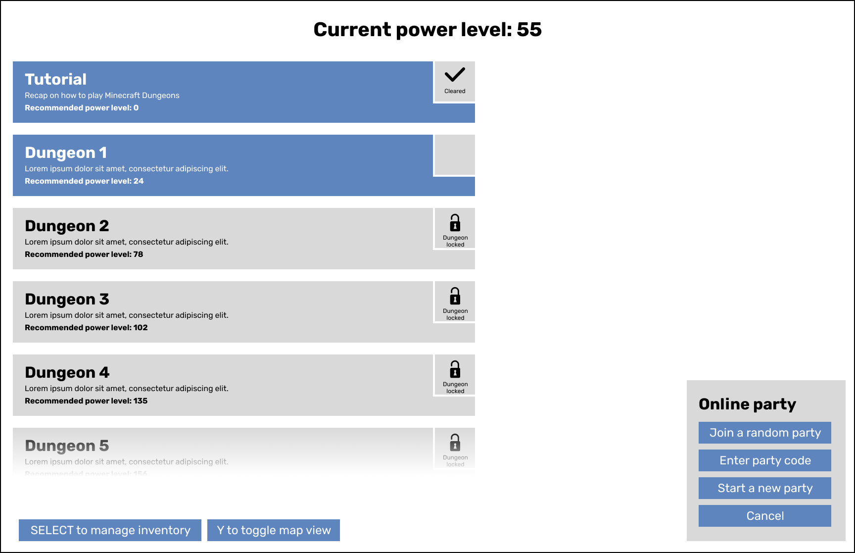
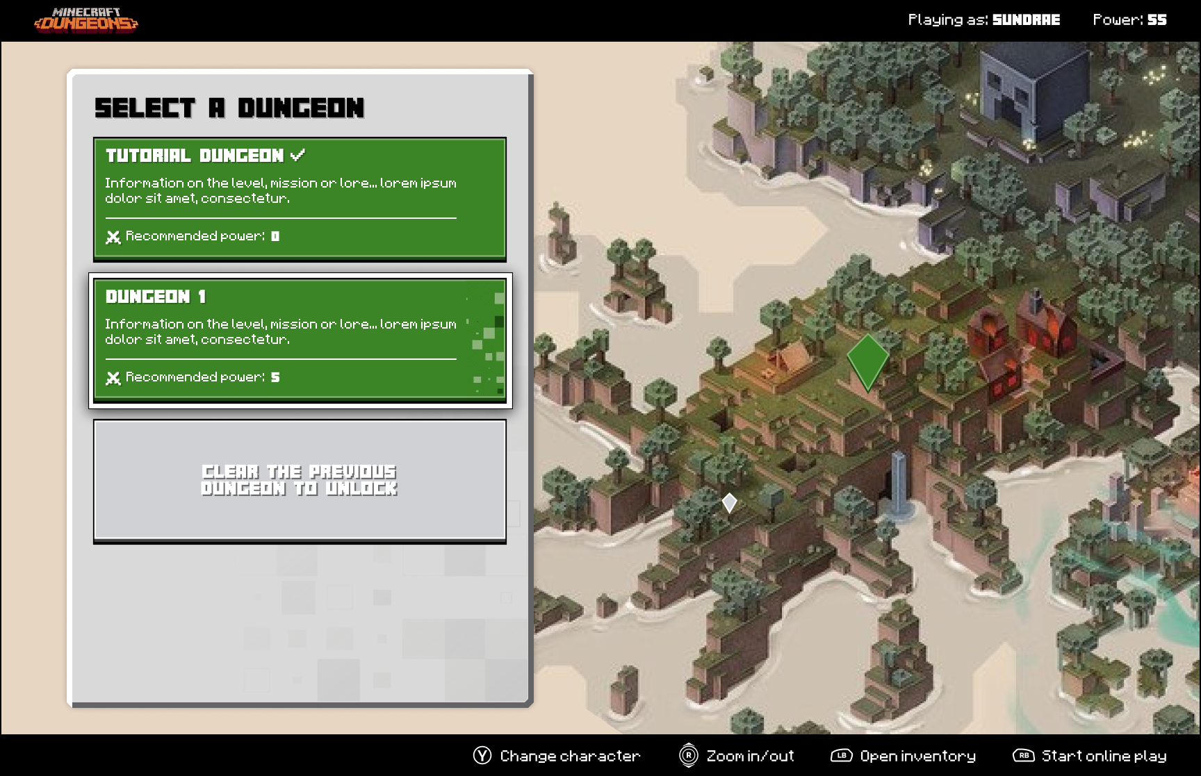
Level Select (Main)
I combined the list and map view to streamline the experience. This also helped fill in the emptiness both screens had and kept things visually interesting and balanced.
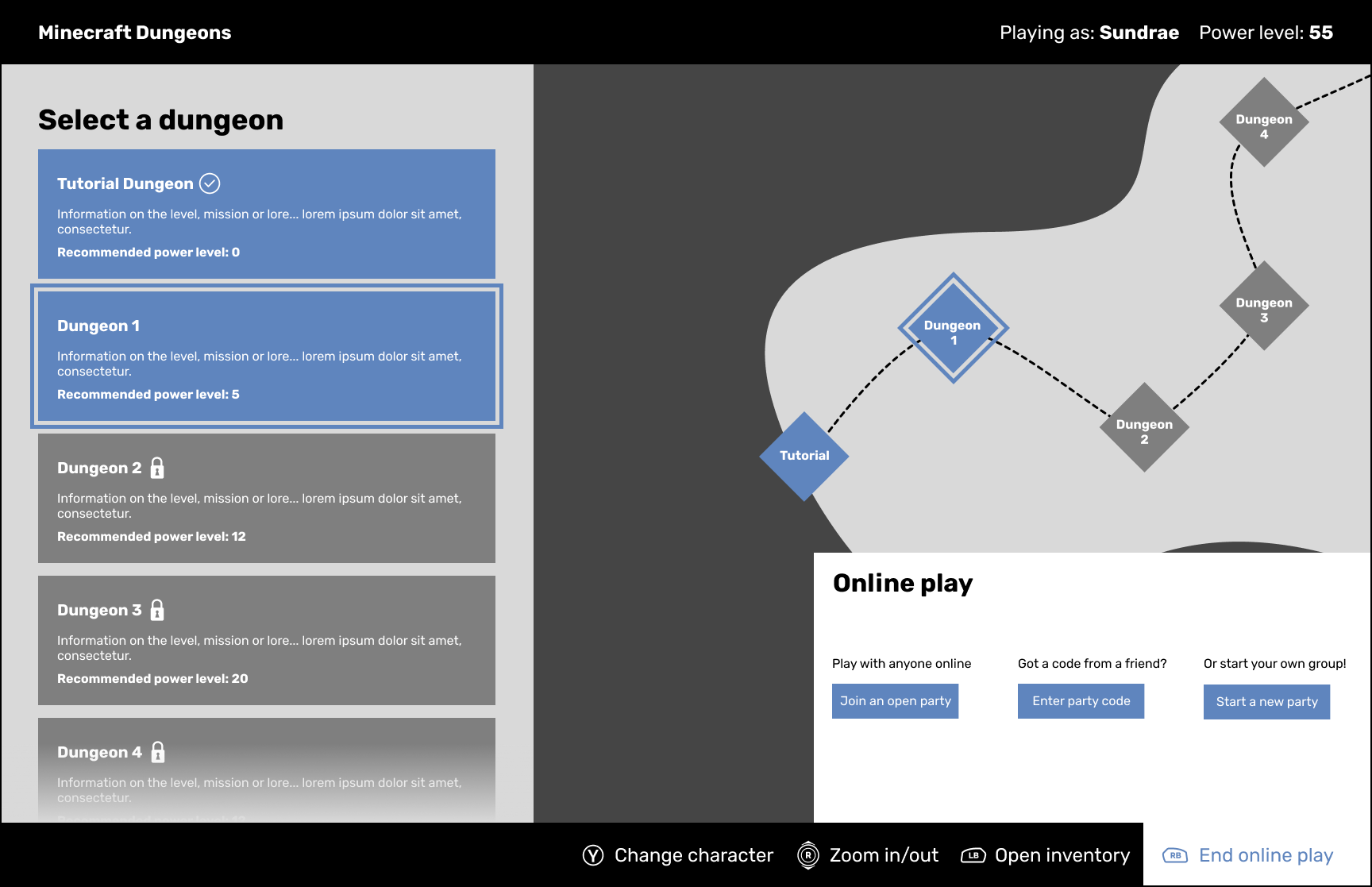
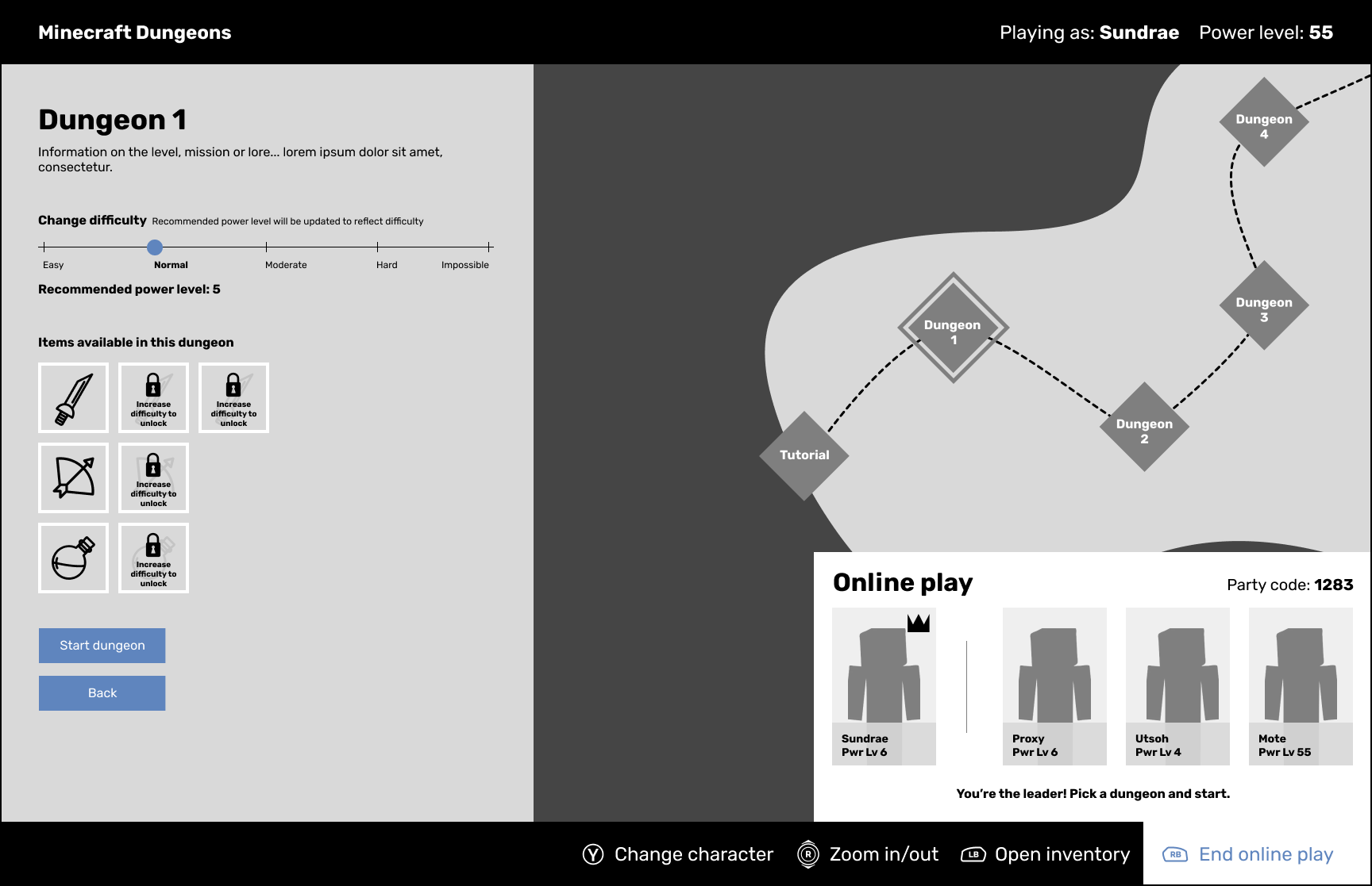
Level Select (Online Play)
This stayed mostly similar other than adding a little more description to each action and resorting how the items were displayed to better match with the other party screens.
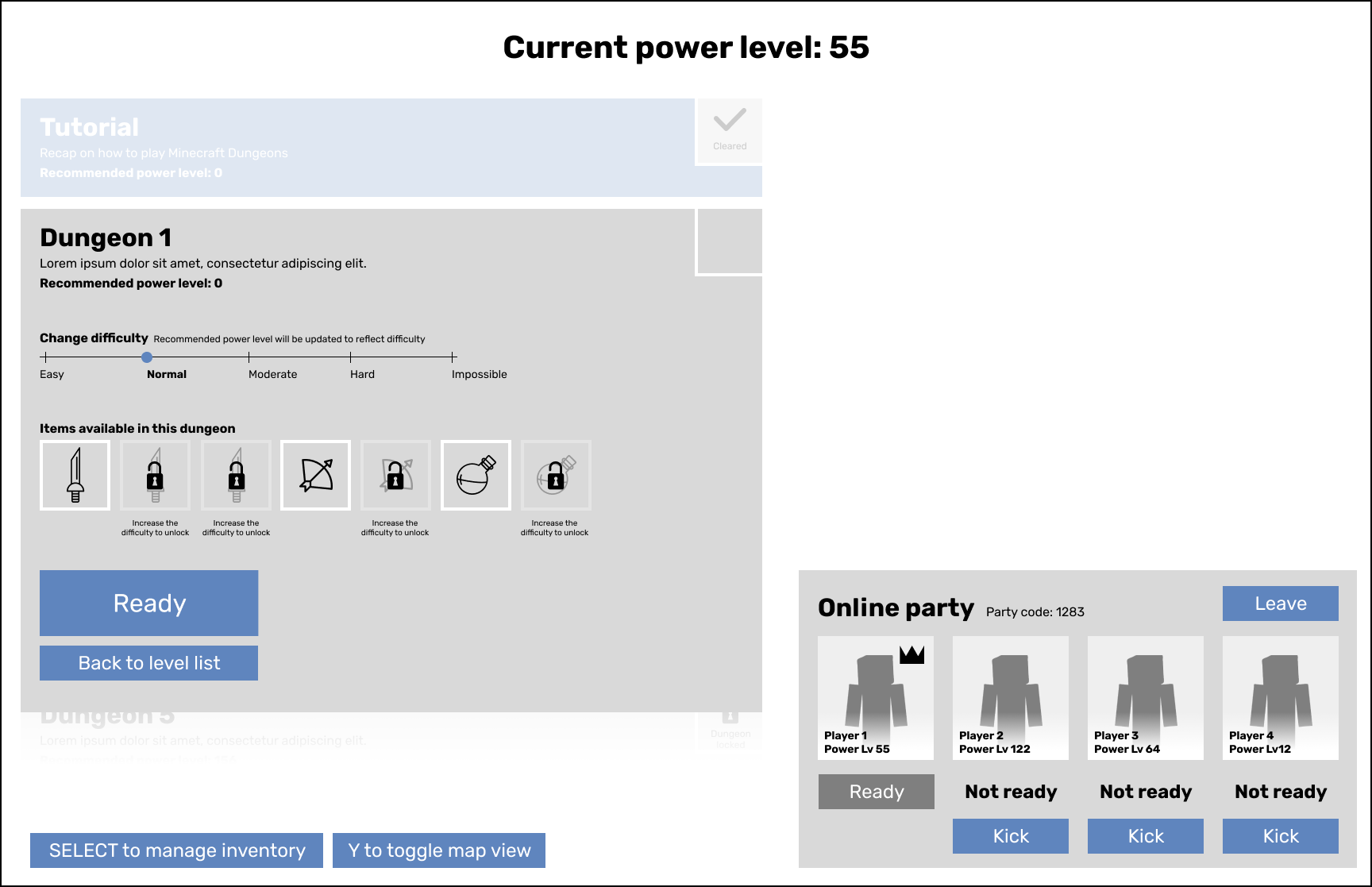
Level Select (Party Leader)
Cleaned up the party screen a bit to better clarify which character is yours and who the party leader is. To match the updated inventory I also laid them out in rows.
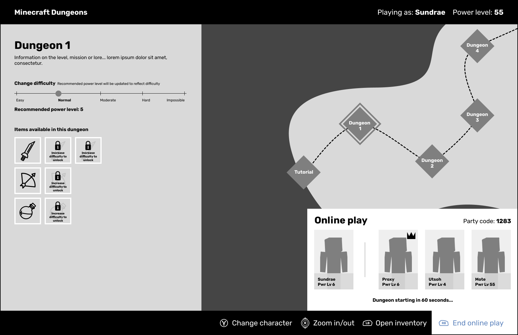
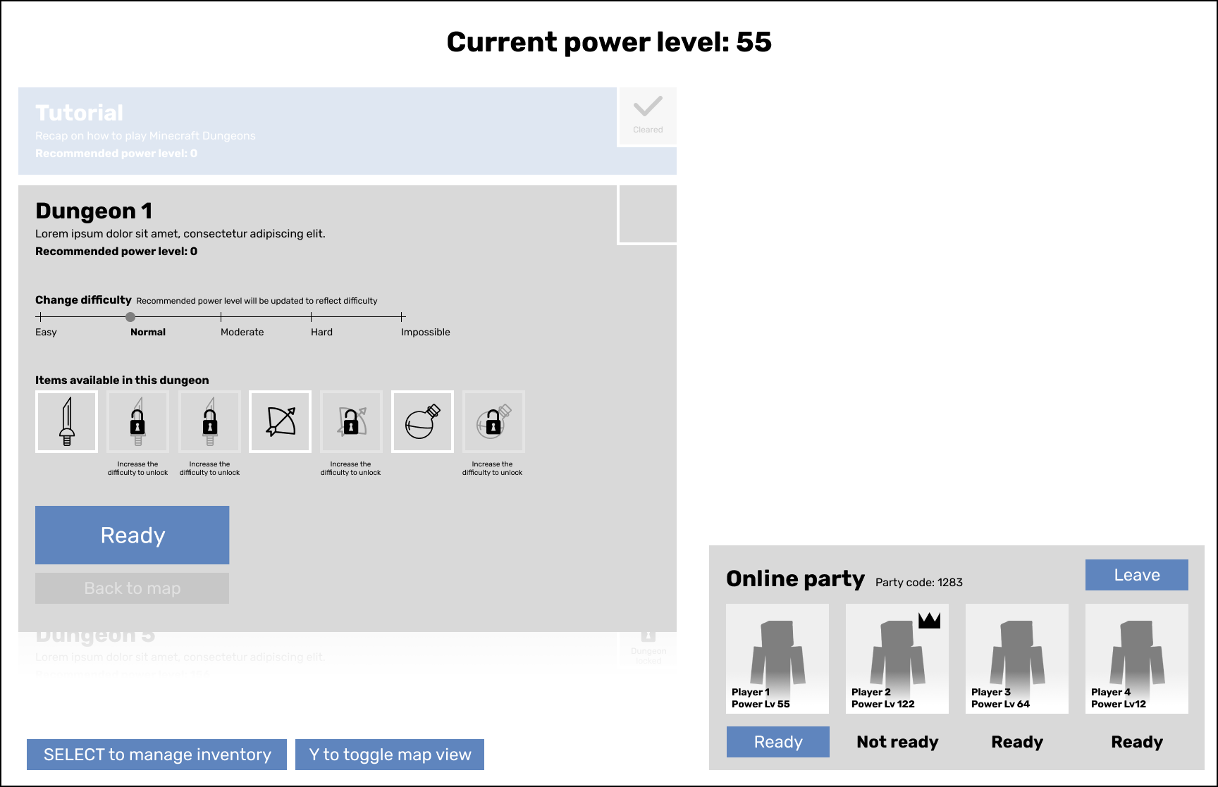
Level Select (Party Member)
Mostly the same interaction as before where if you aren't a party leader you're waiting for the leader to start the dungeon. I added a countdown for the level start to remove "Ready" buttons from everyone. One less action can mean a lot.
Main Menu
Character Selection
Level Select (Main)
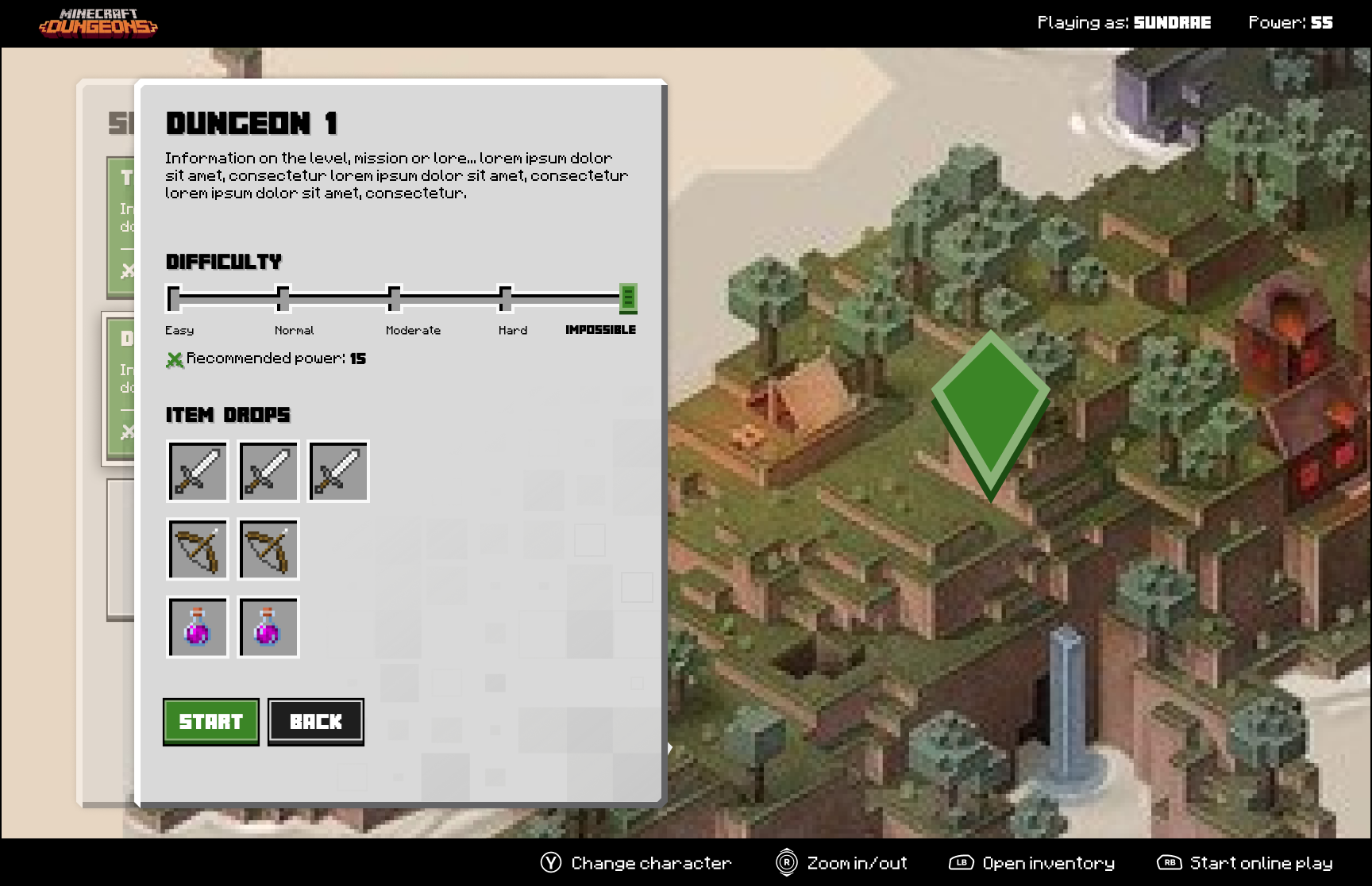
Level Select (Level Selected)
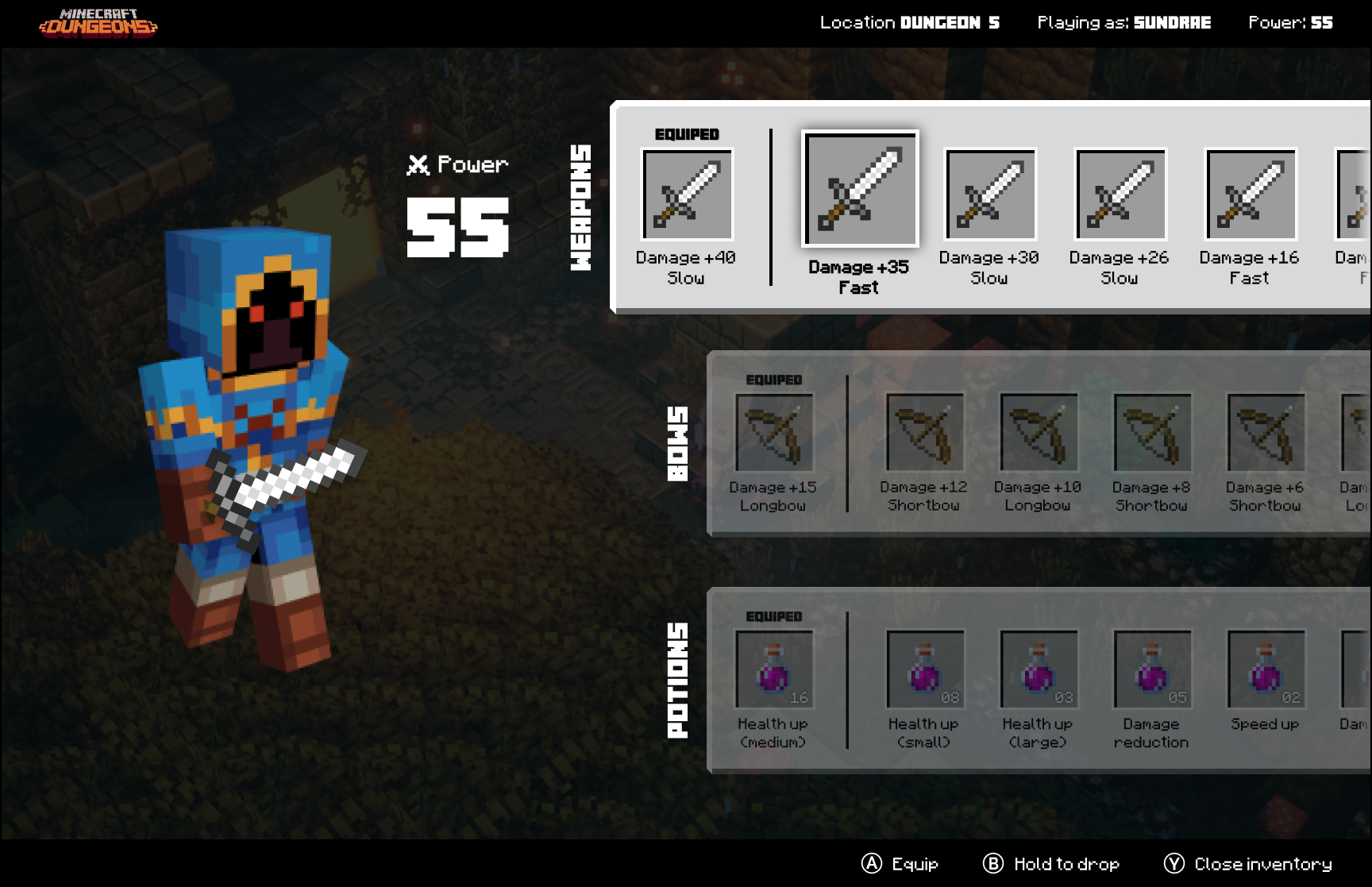
Inventory